
What is accessibility?
Accessibility or inclusive design is the practice of making your websites, software or devices usable by as many people as possible. Traditionally thought of as being about people with disabilities, but making things accessible also benefits other users such as those driving a car, or those with slow internet connections.
It is gradually becoming a standard across the web. From HTML markup, icons and colours, they all work harmoniously to give those with specific requirements a better experience when using the web.
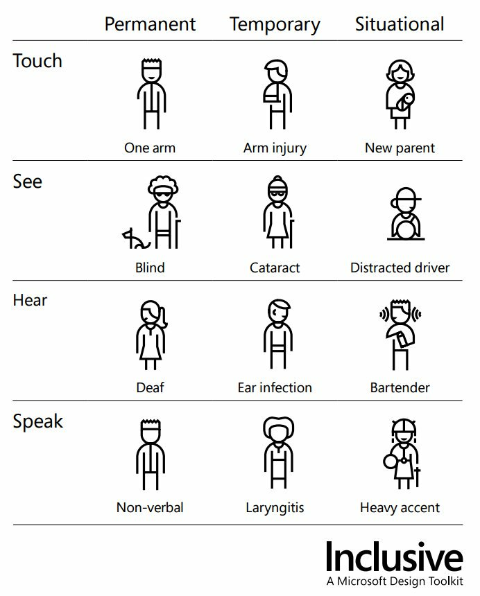
The image below from Microsoft’s Inclusive Design Toolkit shows how there are different levels of impairment in all of us, and by catering for those in the permanent column you are in fact helping millions of users in the process.
How does this affect email marketing?
This is an area that some might not consider the need to put the effort into making it a good experience.
Picture this, you’re driving in your car and you get an email ping through, so you get it dictated to you. But, the email mainly contains images with no alt text, and the text that is in there isn’t laid out in a coherent manner.
That is just one example of how important it could be for your brand to make sure your emails are catering for everyone. Another great example is button size and positioning, most people will use their smartphone with their right hand, with the thumb operating in an arc. Ensuring your buttons/CTA’s are within the arc area makes it easier for users to reach the intended click (or tap in this case).

What can you do in email?
There’s a plethora of steps you can take to make emails better, some are easier than others, it just depends on how much time/resource you have available to implement certain changes.
The basics
Colour
One of the easiest things to implement is colour. Ensuring that your text and/or images with text have a high contrast ratio will make it easier for those with sight impairments to read your emails.
A great tool to check this is WebAim Contrast Checker, simply enter a hex code for your background colour and foreground (text) colour and it will give you a rating based on where the text is used i.e heading or paragraph.
Text
Again going down the sight path, making sure text isn’t too small increases legibility. The standard HTML font size is 16px and should be adhered to in most cases, you may have a web font that looks too big or too small that size, so adjust accordingly.
Going one step further you can use a media query to increase the font size on mobile devices, as the screen is smaller than a desktop, your 16px font could be on the small size.
To do this, use em as your font size, as standard 1em = 16px. Use body {font-size:16px} to force the global font size, then p {font-size:1em} will inherit this size. Simply change the body font size to 18px using a media query and the rest will follow.
Text leading (the vertical space between lines) also helps legibility, 1.5 is usually a good base, more or less may be required depending on the font/use case.
Semantics
Correct layout of your text is also important. Users who utilise a screen reader will benefit hugely if your text uses the correct semantic tags for the purpose at hand.
So instead of using an emboldened span tag to make a heading, use H1, H2 or H3. Then follow it up with a paragraph tag, this way the screen reader knows what to put emphasis on and when to pause.
<h4>
    Hello
</h4>
<p>
    Lorem ipsum dolor sit amet, consectetur adipisicing elit. Eius illo, velit
    animi aspernatur enim sunt temporibus repudiandae quae cumque
    laboriosam maiores quia provident ipsa perspiciatis consectetur quo
    voluptatibus similique assumenda!
</p>
Also, if you want your headings to be capitalised, do this via CSS and don’t type the word in capitals, screen readers will either shout it or it may spell the word out.
Sizing
Making your CTA’s stand out should already be on your list, second nature even. But also make sure the size of them is appropriate, especially on mobile devices.
Some people have small fingers, some fatter. The last thing you want to do is crowd too many buttons/links close to each other, or too small they can’t easily be tapped.
A good size for buttons is 45px tall and at least 45px wide (think social icons for square buttons) and make sure there’s enough space around them to prevent a false tap/click.
Intermediate
Line length
We read best when the line we are reading has between 50-60 characters, but how do you limit characters in HTML without manually inserting line breaks?
Paul Airy from Beyond The Envelope did a lot of research and testing on this matter and concluded that a container width of 32em yielded the optimal character length. Not only this but having a suitably chunky gutter also helps with readability, in Paul’s case 3em to be exact.
Going back to font size, if you body is set to 16px then 32em = 512px (32 x 16). 600px was long considered the optimal width of an email to keep things close together and not spread out. So 512px isn’t far off really, especially when you add the gutter of 96px.


Which of the examples above do you find the easiest to read?
This can be tricky to implement if you don’t use an email design system, some WYSIWYG/Drag & Drop editors may allow you to set custom container widths and gutters/margins.
Serving mobile assets
Although the concept of this is basic, if you’re using a WYSIWYG editor then you probably won’t be able to do it.
Due to mobile screens being smaller than desktop or tablet, you may want different artwork served to make it more legible, or condensed to save vertical space.
Either way you’ll need to utilise media queries to do so, making one thing disappear on desktop, but reappear on mobile.
You could even serve a completely different email if you really wanted, but you’d need a good reason for the time and effort involved.
Advanced
User selected theme
You’ve probably seen accessibility changes in your phone settings before, the most common being inverted colours, and now more recently dark mode (not an accessibility option, but useful in dim light).
You can take a huge step forward and let your users decide what theme they want to see on your emails. This utilises media queries and lots of CSS, but be warned it’s a tricky one to get right and you’d need to build your email from the ground up. If you want to know more, head over to Beyond The Envelope.
Roundup
In summary, there are lots of ways to improve your emails to incorporate inclusive design elements. Start small and work your way up, every step will only help more and more users. Contact the Colewood team for your bespoke email marketing service now.