
What we took away from Litmus Live 2019
As we ascended the grandioso escalators of 155 Bishopsgate, being Litmus Live virgins, we didn’t know what to expect of the day.

We registered, grabbed our bags of free SWAG and headed for the breakfast buffet and coffee machines to fuel up for the day ahead. It was great to see a whole mix of people from marketers, designers, developers and content creators all here to expand their knowledge of email marketing.
TL:DR
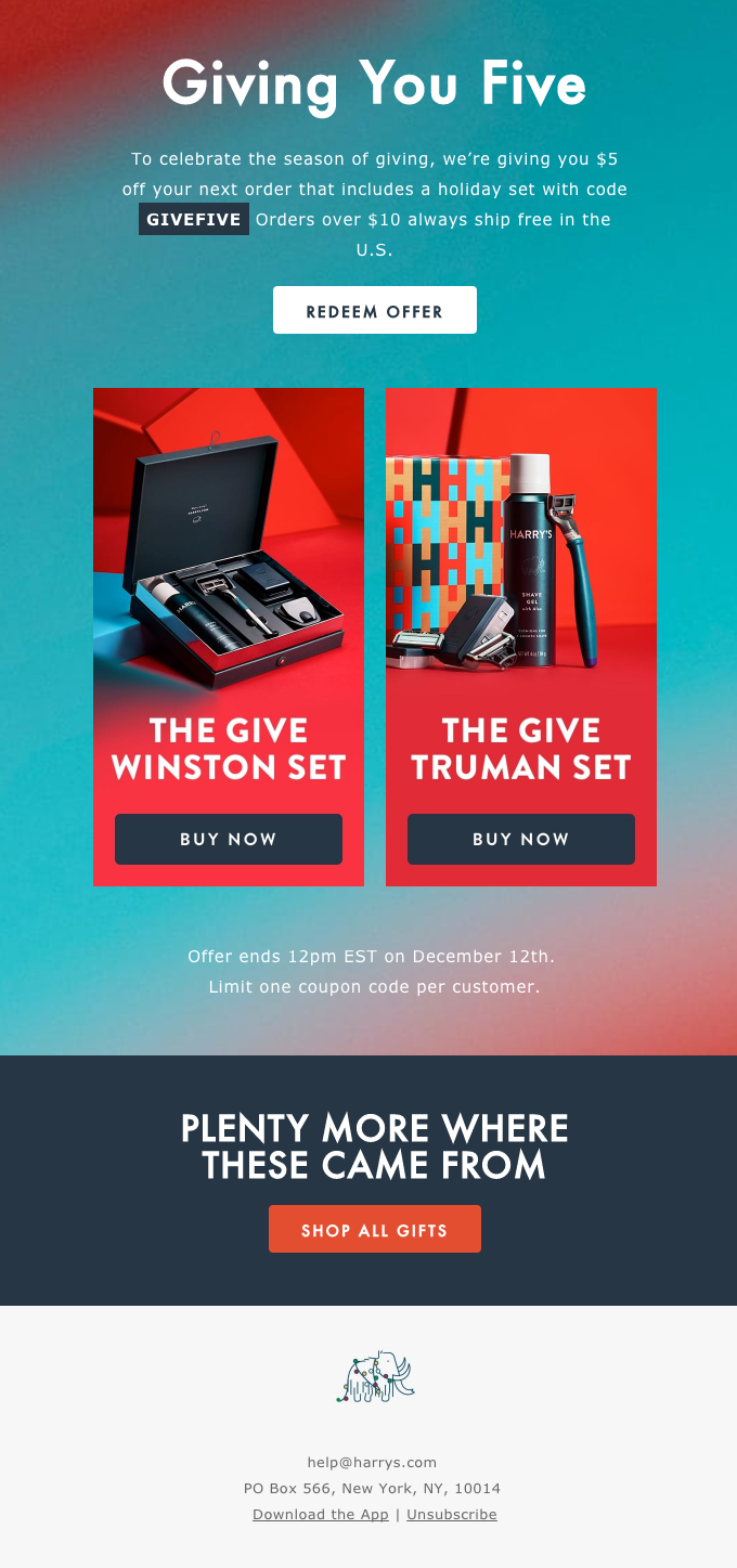
- EQ > IQ – your life experiences increase your overall intelligence and therefore also your customers/clients
- Product = reward, Cost = pain. We can reduce pain activation but not eradicate it
- 5 approaches to your workflow from email rockstar Mark Robbins
- Custom designs/illustrations have 40% more engagement than other visual formats
Note: These talks had much more content, these are just our takeaways from the sessions.
After initial welcomes and introductions, Kait Creamer (@KaitCreamer) from Scaled Agile kicked things off with her talk:
Using Emotional Intelligence to Achieve Email Marketing Zen
Kait talked about the fact that only 15% of our overall intelligence actually comes from our IQ, the other 85% comes from emotional intelligence (EQ or emotional quotient). Which means not everyone has the same experiences and skills, which can result in some misunderstandings…
After thinking she had the perfect subject line for a Star Wars themed, GDPR led, re-engagement campaign which read: “We find your lack of email engagement disturbing” Kait thought she’d see the list increase massively. Instead, users without the experience or knowledge of the pseudo-Darth Vader quote found it rude and told her this via email!
Kait went on to explain that, “Good content isn’t enough”, you need to understand your subscribers and how your ‘cool’ message might be perceived to those without your inside knowledge.
Next up I headed to the Marketing track to learn about consumer profiling whilst Tom stayed on the Design & Dev track to gain insight into fostering innovation in email design.
Why Consumer Profiling is So Damned Hard – JD
Kenda MacDonald from Automation Ninjas (@AutomatioNinjas) delivered some thought-provoking insights into how the brain responds to how we purchase goods and how we can use this information to develop our approach to email marketing.
Coming from a forensic background Kenda explained, through lots of MRI scan research, that the brain uses reward activation and pain activation when we are buying things.
The example she gave was presenting subjects with a box of delicious chocolates, triggering a high reward activation because let’s face it, who doesn’t like chocolate? Once the subject saw the chocolates cost £40, it induced a pain activation in the subjects’ brain, making them less likely to buy the chocolates.
While we can’t eradicate pain activation, we can do things to reduce it. By informing your audience as much as possible with content, they know what to expect from your brand.
How Do You Foster Innovation in Email Design? – TC
Mark Robbins (@M_J_Robbins) from Salesforce delivered a talk on fostering innovation. The talk was all about how to find what works best for you and your team but also to understand if something isn’t working you need to change it. Learning from the mistakes that have been made is arguably the most important part of the process. Mark followed this with some great approaches to find innovation wherever you work…
Naive Approach – The idea of this approach is to not do any research, don’t aim for any goals and, ultimately, fail and learn from the mistake. In this case, doing research and setting goals gives you a biased view of the solutions, and will eventually steer you towards the way other people are solving an issue rather than creating your own innovative idea.
Student Innovation – This is the opposite to the naive approach, in this method you do all of the research, read the tech specs, ask questions and apply the knowledge you have gained and see where it takes you.
Brain Dump – This is the one method I seem to use the most, you put down every idea and don’t think about it, at this stage no idea is a bad one. After you have run dry of ideas, you group them where possible, filter out the revised bad ideas and repeat until you have the best of the bunch.
Perpetual Motion – Another favourite of mine. You work on a project until you get stuck and then start another, and work on that until you get stuck. This time you have the option of jumping back to the first project with a fresh mind or starting a third project and cycling through them. This is a great option if you have a project that you cannot seem to get past or find a solution for, it’s a great alternative to fighting against a project until you find a breakthrough.
Bare Bones – Instead of using a template that has been used for every email for the last year you start from scratch. This lets you break things down to its simplest form and gradually improve on and add to it. We all get tired of the same old emails and templates, this is a great way to find something new.
Following on from the approaches to innovation, Mark stated that approaches out of the norm will be met with resistance of varying levels. Especially if, “We have always done it this way” but, always remember that many peers have been proven wrong.
We re-grouped, after a short break, in the Design & Dev track to listen to Lily Worth’s (@Lil_Ms_Worth) speaking debut about trends in email marketing design:
Big, Bold, and Trending: Visual Design Techniques to Ignite the Inbox
Bold Colours & Gradients
Using bold colours immediately stimulates the user, giving them something visually interesting that might not be an image.
Implemented correctly it draws the user down to the CTA’s you want them to click. But be careful, if you don’t get your contrast right it might be hard for some visually impaired users to read
Head to WebAim to check your contrasts now.
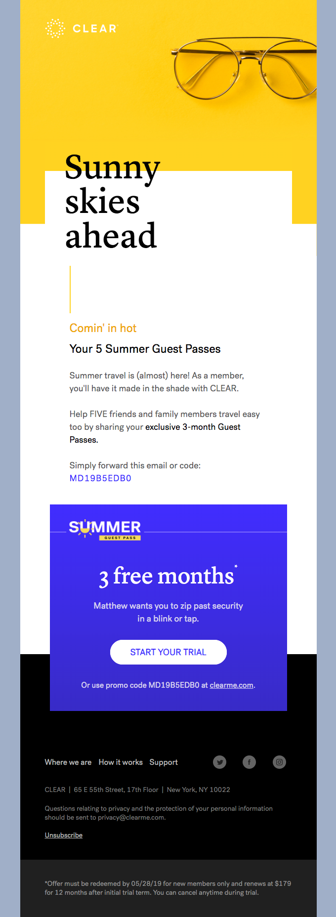
Off-Grid & Abstract
This kind of layout has been around in print for a long time, off-setting text to the box it would usually be contained in.
In email, this can prove difficult as they are naturally very structured grid-based layouts. To achieve this trend, images will need to be used effectively to give the impression you are breaking away from the grid.
Lily goes on to say that it’s a good way to break up long emails, by breaking away from the norm you mix up the ordinary for the user.
It doesn’t always have to be horizontal breaks as you can see from the Clear design, the
BOLD Typography
Sometimes you just need to get your point across fast. The best way to do that? Big, bold typography.
It draws your eyes immediately, letting you know what the marketer wants you to read. A great example of this is:
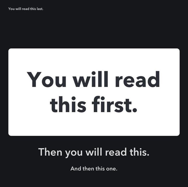
Using typography to your advantage will direct users to the right part at the right time.
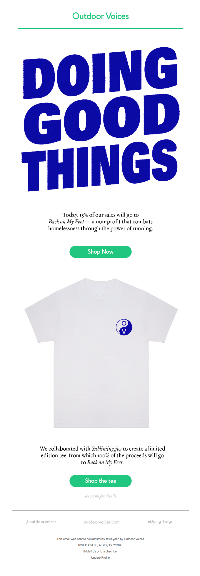
Custom Illustration
Sometimes stock imagery just won’t cut it. And let’s face it, how long do you try and find the perfect stock image only to be met with the same stagnant pool?
Research also shows that custom illustrations/designs have 40% more engagement than other image formats. You may be sad to find out that GIF’s and memes have only 5% engagement.

Lily also covered minimalistic design and micro-interaction GIFs but this post is getting a bit lengthy now, so sorry if you’re reading this Lily, but I need to end it somewhere!
Before lunch, everyone sat down to watch user-submitted emails get picked apart, live, on the big screen in front of 250 peers, yikes!
It showed the importance of using text as well as images, having a fallback background colour set and styling image alt text to keep your branding prevalent.
Half the day down and we gained insight into a tonne of stuff as you can see above. Part 2 will cover what we learned in the afternoon sessions.